This case study focuses on simplifying the current form-heavy process. Undertaken as a six-week solo project for an RMIT short course, it explores potential solutions for a more efficient patient experience.
Role
UX Designer
Timeline
April – May 2024
Framework
Double Diamond
Platform
Mobile
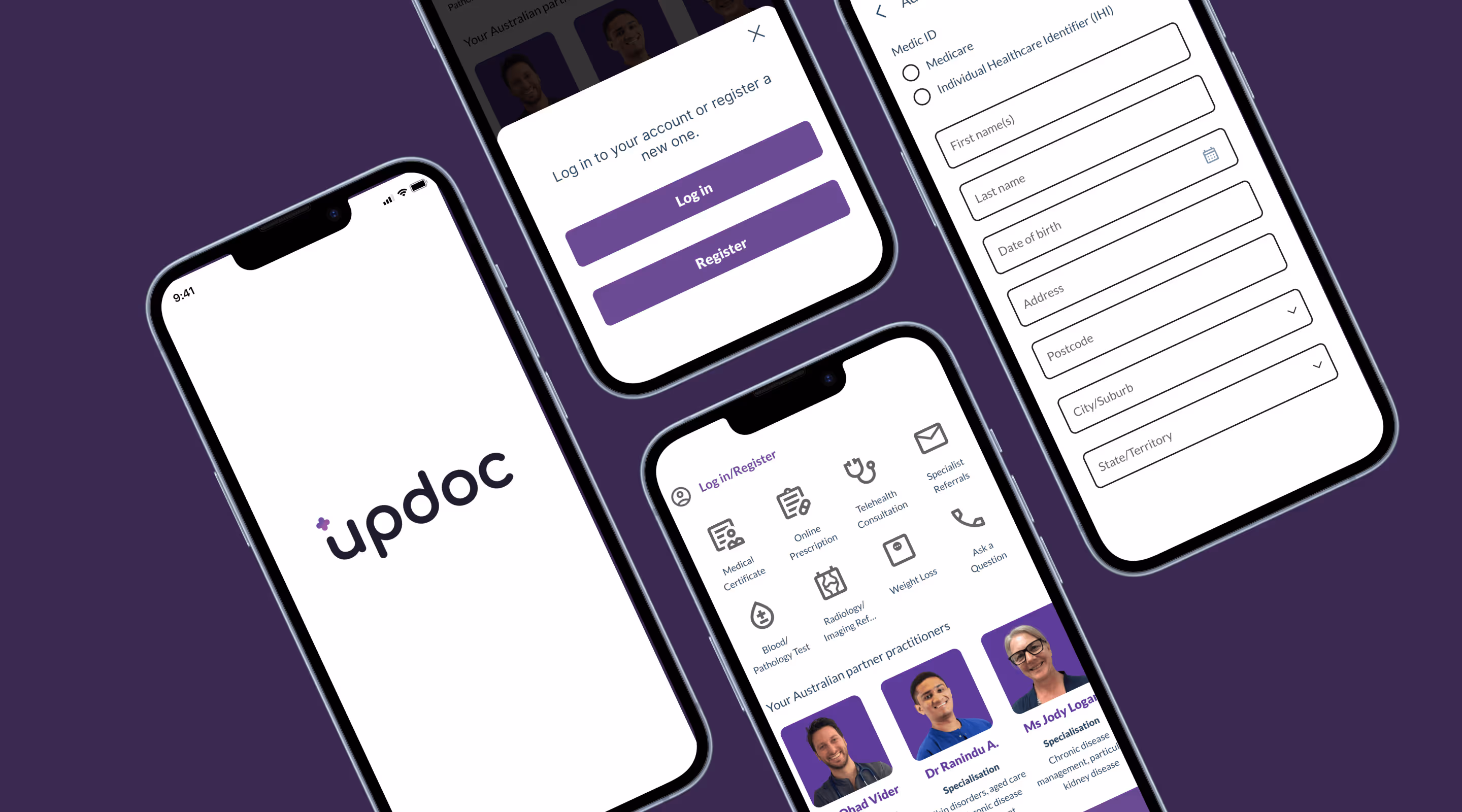
Before
After
//
Context
The problem
Updoc's homepage currently prioritises consultation products, resulting in a less prominent login entry point.
Redundancy in the form-filling process, which contributes to user friction and inefficiency. Users are required to enter their name twice, once for patient details and again for Medicare information.
//
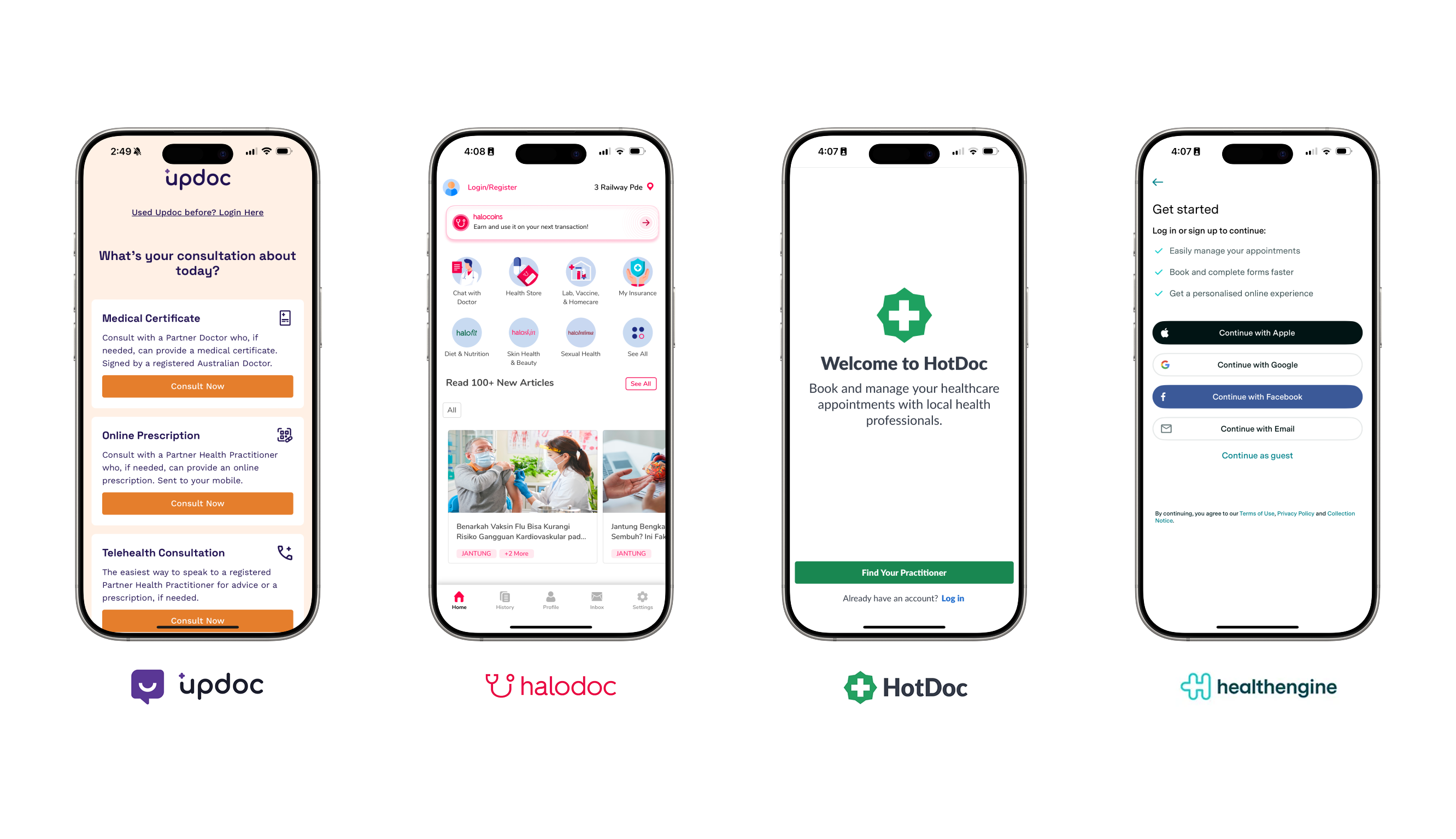
Competitor analysis
Competitor analysis revealed that prominent login/register placement is a consistent industry best practice.
For Updoc, this easy account access is crucial given its subscription-based business model, where retained users are key.
Feature
Updoc
Halodoc
HotDoc
Health Engine
Login touchpoints
Homepage
Homepage and navbar
Onboarding and navbar
Onboarding
Is login required?
❌
✅
✅
✅
Quick login
Unavailable
Phone number login
Unavailable
Social media login
//
Target users and research methods
I interviewed Millennials who have experience with telehealth consultations, conducting the interviews via Zoom calls.
"Imagine, you're already feeling terrible, the last thing you want to do is fill out a massive form just to start talking to a doctor."
Participant 1 - Mutiyani
//
Research goals
I wanted to understand why users choose telehealth consultations, their ideal pre-consultation flow, and their opinions on having an account on the platform.
Key insights & recommendations
After conducting user interviews, I found that users prioritise convenience, speed, and simplicity.
🔐
Enable social media logins
Users view the app as a tool for repeated use, enabling social media logins streamlines the login process. An account also allows users access to their complete medical history.
🎯
Eliminates repetitive forms
Data saving via login eliminates repetitive forms. Therefore, strategic prompts and multiple entry points are crucial for a smoother, more intuitive user experience throughout the app.
✨
Auto-fill patient details using Medicare/IHI input
Streamline data entry by automatically populating patient information like name and date of birth when users enter the Medicare/IHI details.
//
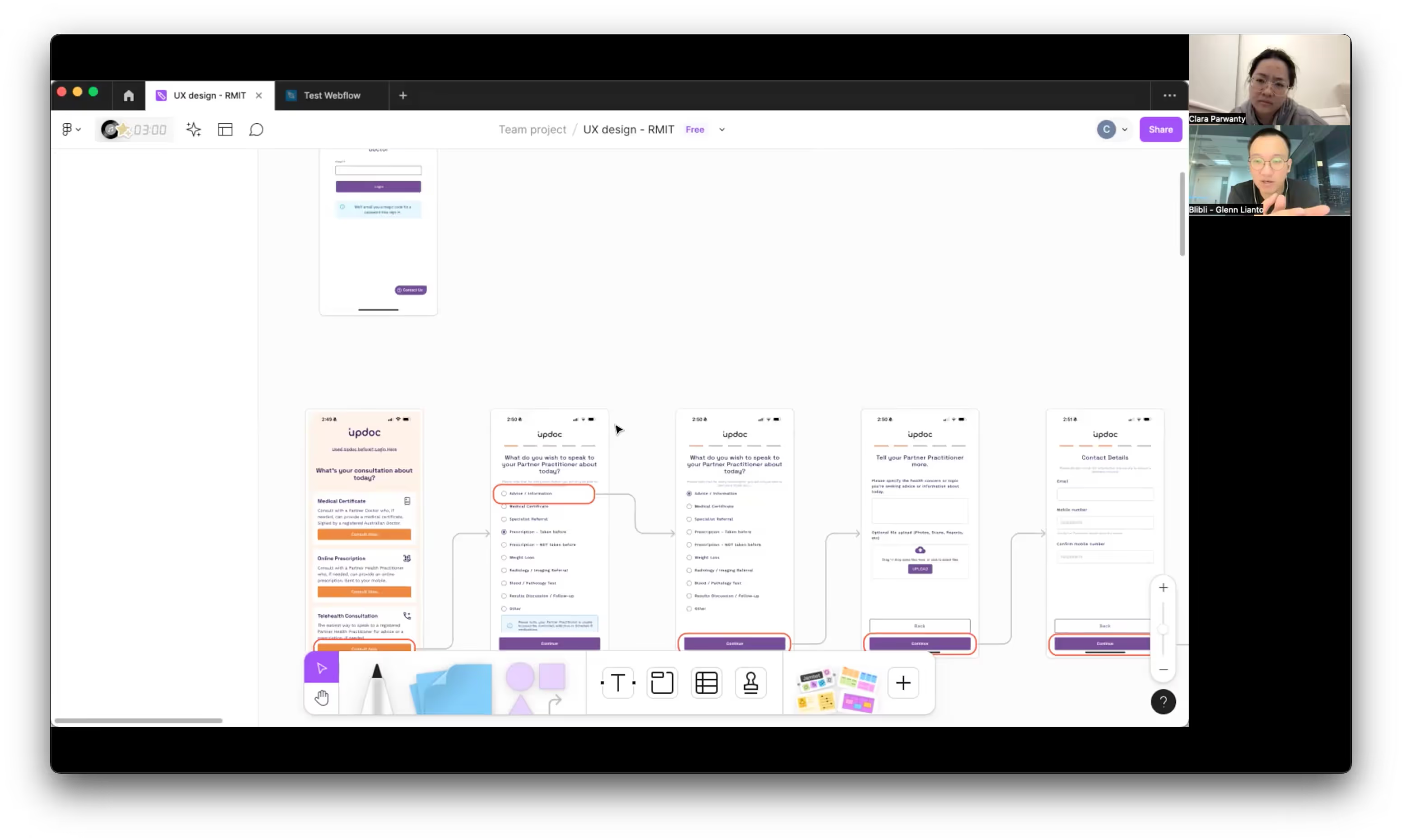
Prototype
//
Key insights from usability testing
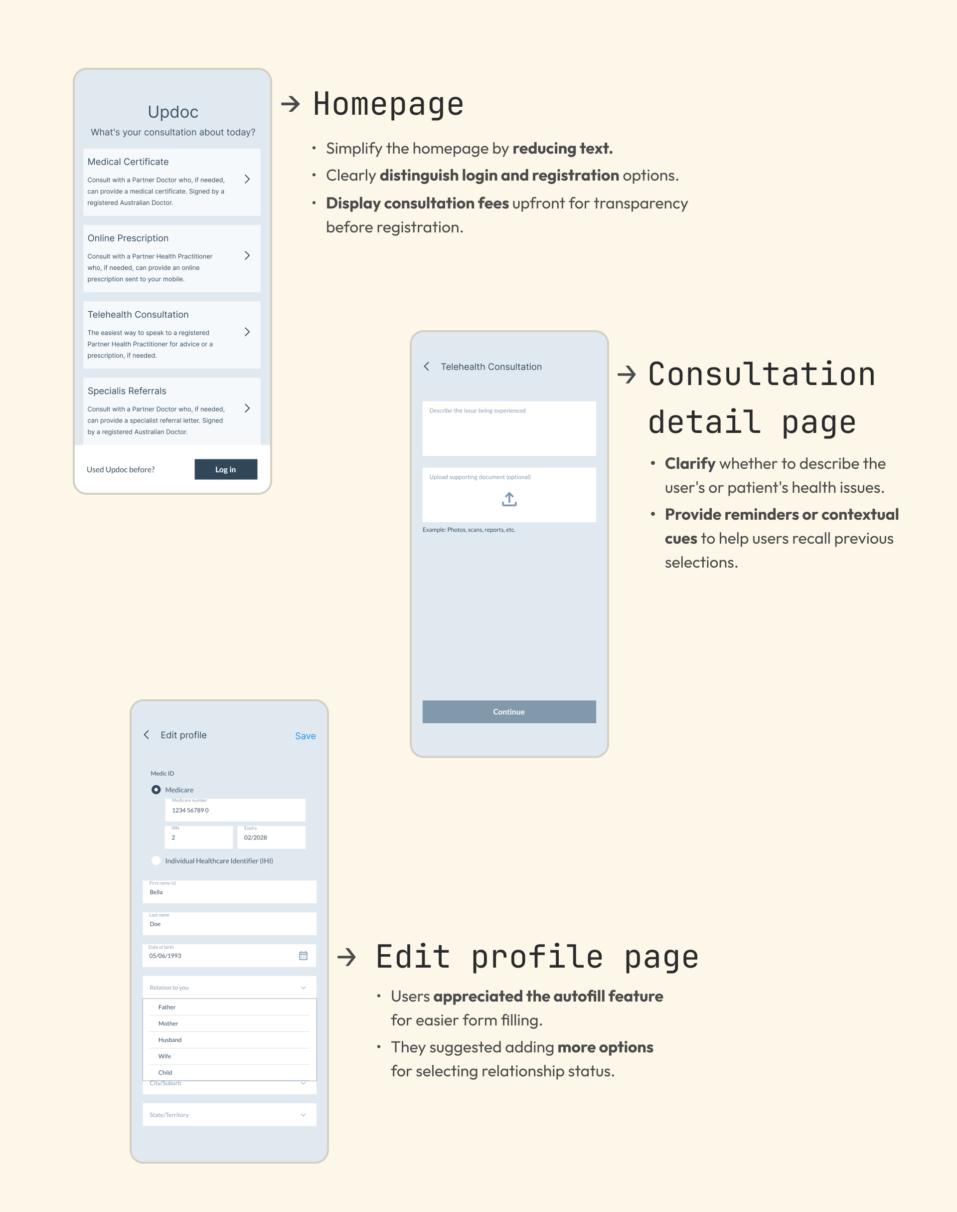
Three major usability insights were identified on the homepage, consultation detail page, and edit profile page.
//
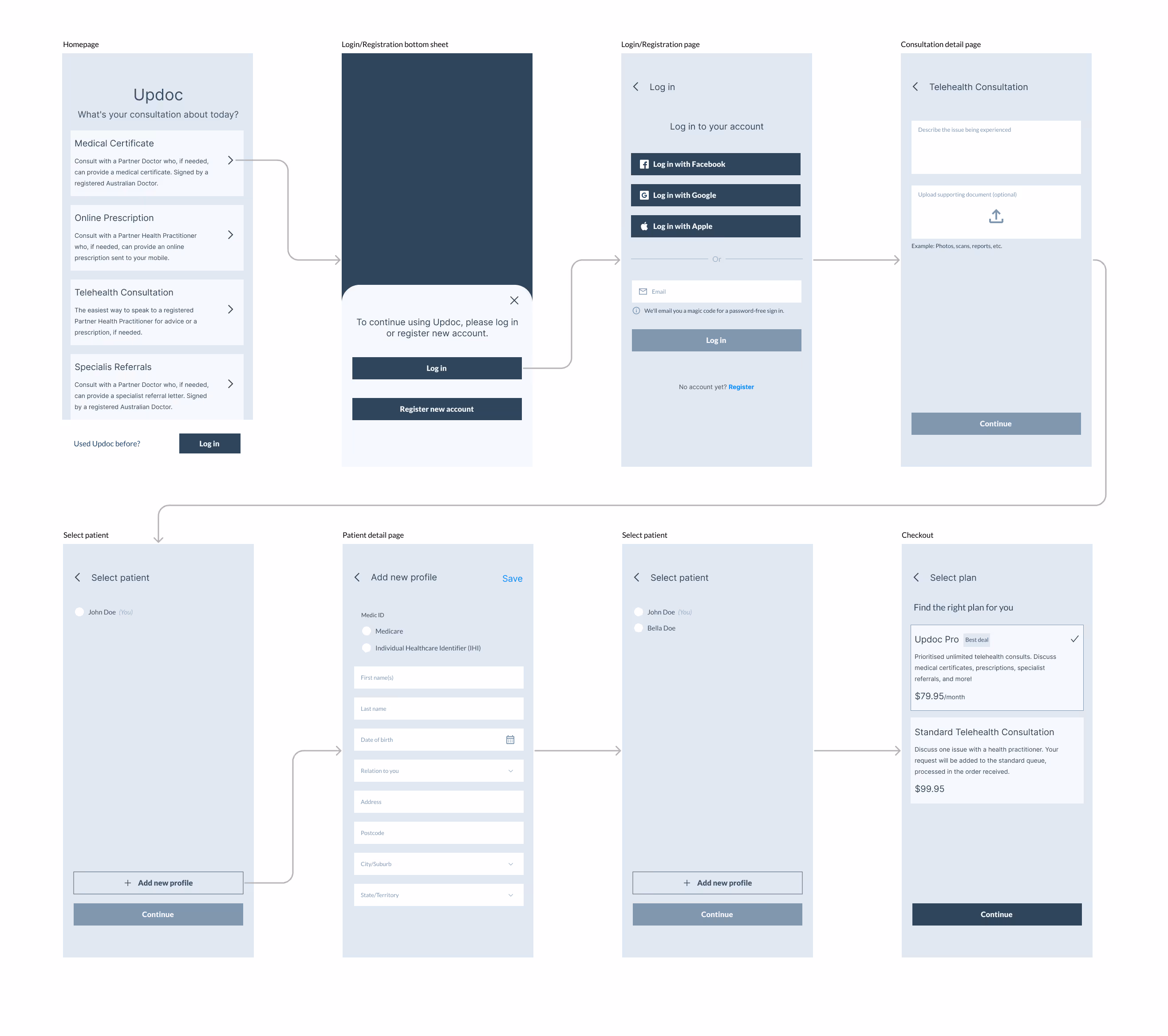
Design solution
01
Adding multiple touchpoints for login and registration, converting Updoc products into icons, and displaying pricing info upfront for transparency.
A dedicated button for login and registration, with consultation product selections and some navbar menus also directing users to it. Updoc products are now icons to reduce text, and pricing info is displayed providing transparency and informing users of costs before registration.
Multiple touchpoints
02
Highlighting the patient’s name on the consultation detail page serves as a reminder and ensures continuity throughout their journey.
Providing the patient's name assures users when describing whose health issues are being addressed, whether it's their own or the patient's.
Highlight patient's name
03
Autofill capability using Medicare/IHI data to minimise extensive form filling.
And this page offers more options for selecting the relationship status between the account owner and the patient.
Autofill
Creating frictionless experience required for Updoc's subscription-based business model through two key changes:
Adding multiple touchpoints to log in/register (including social media login) for easy repeated use.
Eliminating repetitive forms through auto-fill patient details via Medicare/IHI input.
The final prototype – give it a go!
//
Takeaways
Over the six-week course, I got hands-on with the Double Diamond design process. It really helped me learn how to frame questions to nail down the ideal user flow. If I had more time, I would've loved to interview more Updoc users. When I presented my project, my mentor was super supportive and really liked the solutions I came up with. UX is all about stepping into the user's shoes, listening to their likes and pain points, and then finding the right solutions from there.
Daniel Diaz
Course Mentor
"
Congratulations Clara, on successfully completing the six-week course! Delving into new skill sets, tools, and the dynamic world of UX design within such a condensed timeframe is no small feat, so your achievement at reaching the end is a fantastic achievement. It's been great reviewing your project and observing how your work has progressed through the milestones.
Let's delve into some feedback regarding your final project: You did a great job introducing UpDoc and the current user flow. You did a great job with your desk research using competitive analysis to help revise and update your hunch. You did a fantastic job introducing your user interviews and interview goals, your findings were really great and you did a really nice job with your presentation here. Your ideation process was great and I really appreciate you taking me through your ideas, this is always helpful and it primes the prioritisation and gives me a clearer understanding of where solutions have been placed, again here you did a great job explaining your prioritised solutions.
You did a great job with your paper prototype and it was nice to see you advance this process by creating a digital prototype so you can test it online. Remember there are ways you can make paper prototypes clickable in Figma and using another app like Marvel. This may help you in the future to save some time. You also did a fantastic job explaining your findings from the testing process. You did a great job explaining your final prototype and user flow, your final solution was excellent and you did a fantastic job explaining your design solution as you took us through the process. I can also see that you have been able to design and create a functional prototype in Figma to a really high standard which is awesome. Great final solution! Amazing work on your overall presentation, you nailed your final project! Once again, great work, Clara! It was a pleasure mentoring you throughout the course. I hope you've found the content valuable and have enjoyed learning about UX. Thank you for all the effort you put into your final project.
... your final solution was excellent and you did a fantastic job explaining your design solution as you took us through the process. I can also see that you have been able to design and create a functional prototype in Figma to a really high standard which is awesome. Great final solution! Amazing work on your overall presentation, you nailed your final project! Once again, great work, Clara! It was a pleasure mentoring you throughout the course. I hope you've found the content valuable and have enjoyed learning about UX. Thank you for all the effort you put into your final project.