UX design
Creating a frictionless complaint experience
This case study details my process for redesigning the complaint submission flow for Ajust. The goal was to transform a frustrating and inefficient user experience—particularly for customers dealing with service outages, into a frictionless one.
Timeline
August 2025
My role
UX designer
Context
Imagine this...
Your internet goes down. You spend hours troubleshooting, only to get nowhere with the company's support. You're frustrated, and your time is wasted.
This is where Ajust comes in
It'll help you get a resolution by using AI to transform raw info about your issue into a clear, compelling message that businesses can't ignore.
Sending the complaint
After all the frustration, the last thing you want is another complicated process. You need a flow that is seamless and frictionless, making the experience of submitting your complaint as quick and painless as possible.
target Audience
Who are the target audiences?
Based on desk research, the primary target audience consists of everyday Australians who are frustrated with a specific service or product. These are individuals who value their time and seek a frictionless way to resolve issues without getting bogged down in lengthy and confusing customer support processes.
I created a persona to serve as the foundation for this study. By understanding the background and emotional journey, I was able to identify specific pain points and design a solution that addresses her needs.
"My internet is my business. When it's not working, my livelihood is on pause, and the last thing I want to do is spend an hour on hold to get it fixed."

John

Age: 32
Occupation: Freelance graphic designer
Location: Sydney

Background

John's entire livelihood depends on a stable internet connection for uploading large files, participating in video conferences, and collaborating with clients. He works from his home office and uses Telstra for his internet service.

Scenario

During a key client presentation, John's internet fails. He apologises using mobile data and contacts support, only to be stuck in an unhelpful chatbot loop, increasing his frustration.

Concerns

Intermittent connection, damaged professional reputation, confusing support process.

Feelings

Frustrated and stressed. Feeling embarrassed and helpless.

Goals

Immediate fix, clear communication, and reliable connection.

Form field sort
As-is
As-is experience
Users naturally begin a form by typing their issue into the text field. However, the existing flow had a critical flaw: when a user selected a category chip afterward, it would instantly delete their detailed message.
This was especially frustrating for someone already dealing with a high-stress problem.
After
Empathetic approach
The key change was replacing the single-select chips with checkboxes, which not only eliminated the frustrating issue of a user's typed message being deleted but also gave them the flexibility to select multiple issues.
Assuming the chips represent the most common issues, they are now listed as the first options for quick selection.
For all other issues, an "Other" option is available. This reveals the text field only when selected, which reduces visual clutter and prevents the user from feeling overwhelmed. The text field itself provides the flexibility for users to provide a concise or detailed description of their issue.
After
The guiding button
For resolution and compensation options, a radio button is used instead of a checkbox. This design choice ensures users can select only one option, minimising errors and clearly communicating the expectation of a single, specific outcome.
Date picker
As-is
As-is experience
Typing in dates manually, especially when dealing with issues that lasted multiple days, was a real hassle. It often led to mistakes and took up more time than it should have, making a simple task feel unnecessarily complicated.
Multi-select date picker
After
Select several dates at once
I designed an intuitive date picker that allows users to select multiple dates in a single, fluid motion. This solution replaces the inefficient and error-prone process of manual keyboard entry, dramatically improving the user experience for issues that span across several days.
Edit Generated Text
As-is
As-is experience
The design offered two separate paths for editing a message—direct text input and a secondary "Add Detail" button. The flaw was that these two actions were not integrated; using the "Add Details" option would completely erase any edits the user had made, creating a frustrating, non-linear experience.
After
Rewriting the flow
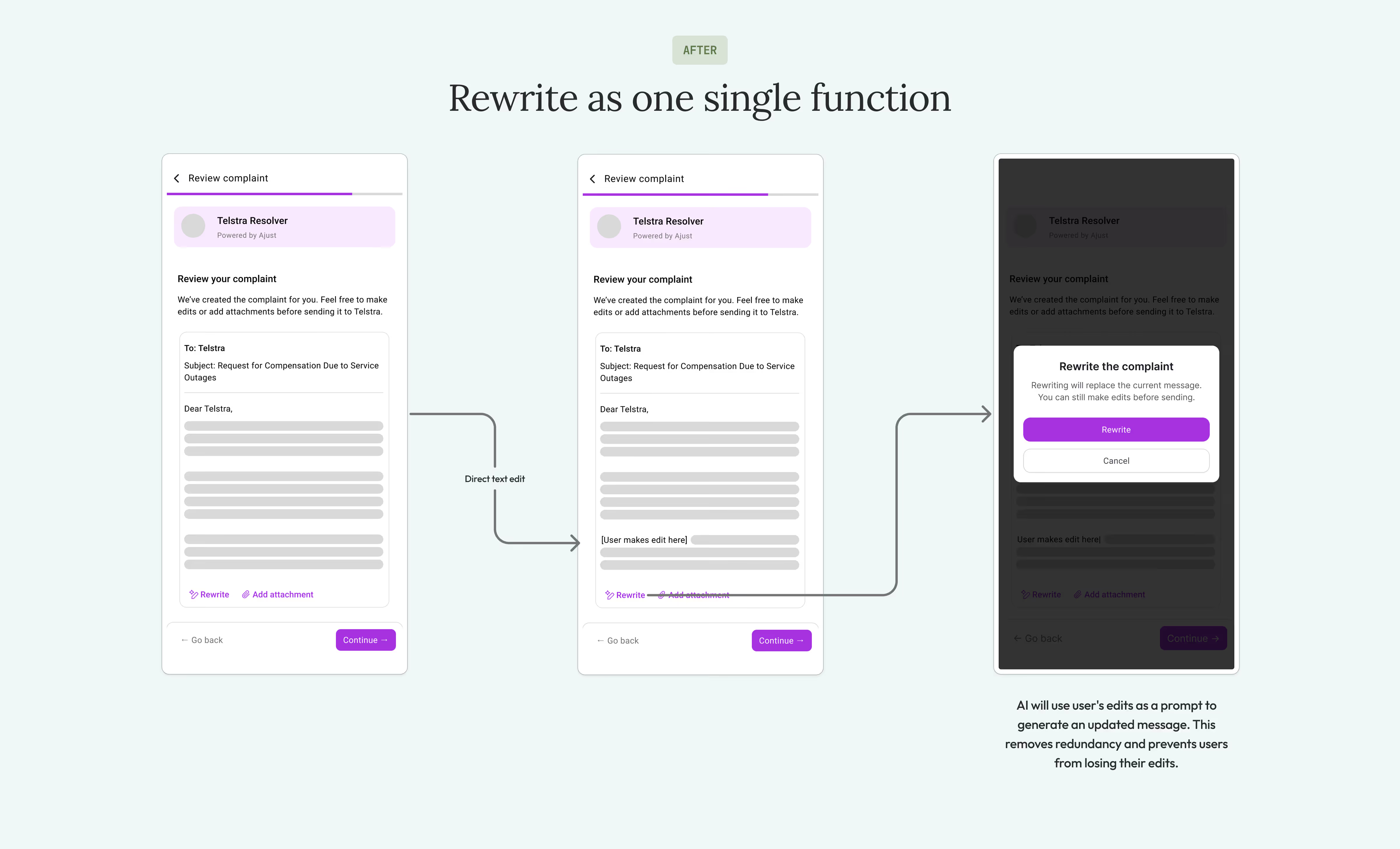
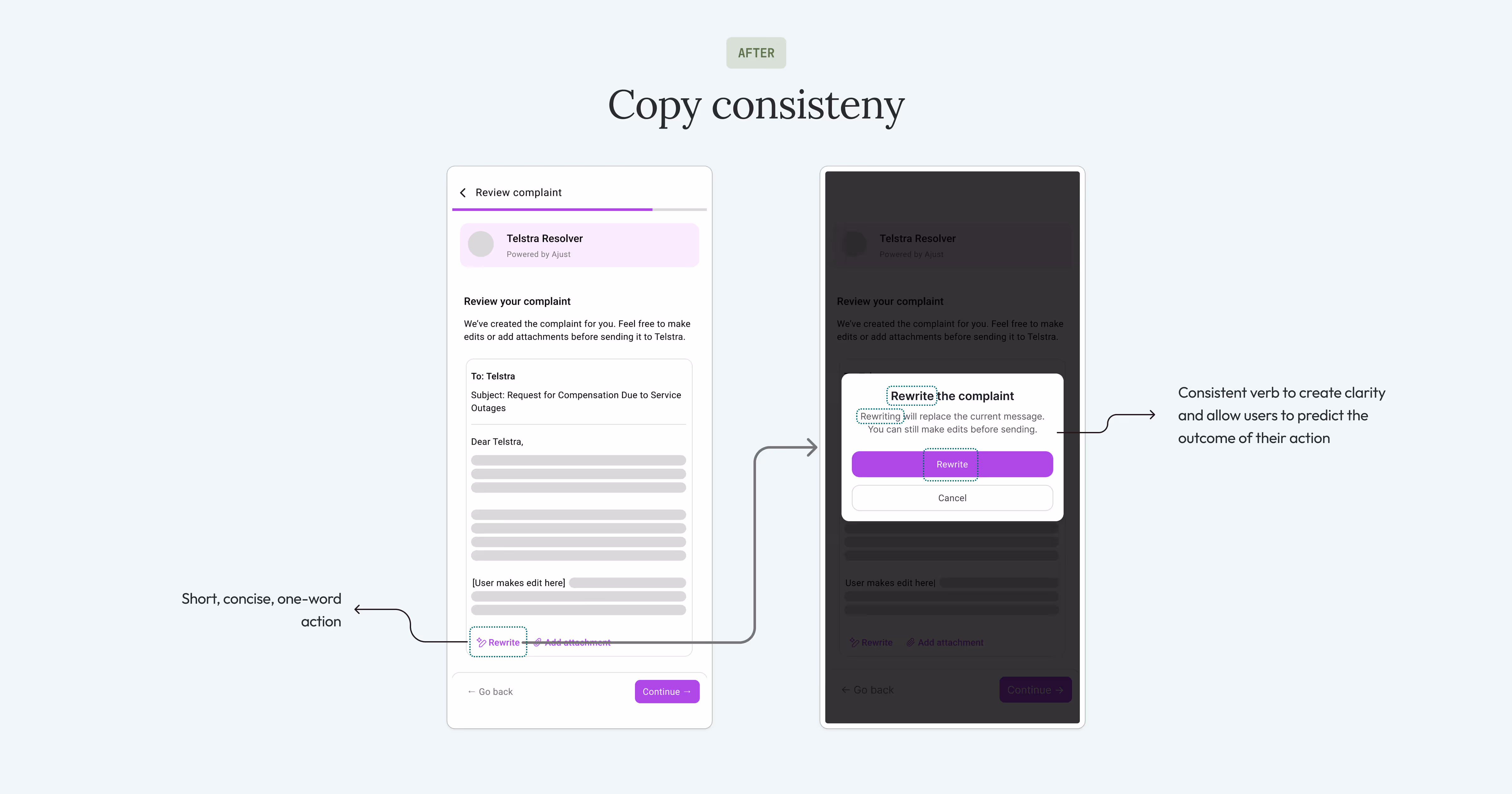
To fix the redundancy and frustration in the original design, I streamlined the entire process. I replaced the "Add Detail" button with a single "Rewrite" function.
This new design allows users to continue making direct edits to the generated message as before. However, if they want the AI to refine their text, they can now click "Rewrite." The AI then uses their prior edits as a new prompt to generate an updated message.
This new, integrated flow ensures that a user's valuable edits are never lost, creating a more intuitive and respectful user experience.
After
Rewriting the copy
I updated the wording for the modal's copy and CTA to make it more consistent and straightforward. Now, the title, body, and CTAs all use the same action-oriented verb. This way, users know exactly what to expect from the moment they click the CTA, see the modal, and finally, press the last button.
Chat box
As-is
As-is experience
The only way to access the chatbox was through a 'not found' business search, with no other options available. Once you entered the chat, there was no way to exit or minimise the chatbox, leaving you stuck in a conversation you might not want to continue.
After
Intuitive interaction & navigation
To improve the overall flow, I made three key adjustments. I moved the interactive chips closer to the text field to improve accessibility. The interaction was also updated so that clicking a chip now pre-fills the text field instead of overwriting the user's input. This allows for both quick selection and the flexibility to add custom details.
I created a simple and consistent navigation loop by adding a back button to the chat page that returns users to the homepage, where the floating chat button is located.
The final prototype – give it a go!
See other works
Updoc pre-registration flow