How this portfolio came to be
A behind-the-scenes look at the design decisions, challenges, and learnings from building this site from scratch.
Phase 1
Minimal & clean🤍
I started with a minimal approach—clean layout, restrained colour palette, lots of white space. Safe and professional. But as I looked at it, something felt off. It was polished, but it didn't feel like me. It lacked warmth and personality.
Phase 2
The sparks💡
On a trip to Jakarta, my dad took me to Pancoran Chinatown. A small bakery caught my eye—fresh, modern, yet blending seamlessly with the vibrant market. That contrast, that balance of energy and structure, was exactly what I wanted. It clicked.
Phase 3
Bold & vibrant🎨
Inspired by the vibrant colours, I redesigned using bright neon hues and dynamic shapes. It was full of character, but maybe too much. Feedback revealed the colours were too bright, making it hard to focus on the content.
Phase 4
Soft & warm🧸
The final iteration found the sweet spot. I kept the colour and personality but made everything softer, more muted. Warm neutrals paired with gentle accents. It still has energy—but now it's inviting, not overwhelming. This feels like me.
The evolution
v1: Minimal
July 2024
Clean but generic. Safe but forgettable. Lacked personality and warmth.
v2: Vibrant
January 2025
Bold neon colors and energetic. Had personality but too bright—overwhelmed the content.
v3: Soft
October 2025
The sweet spot. Muted, warm colours that invite rather than shout. Personality with polish.
Why these colours?

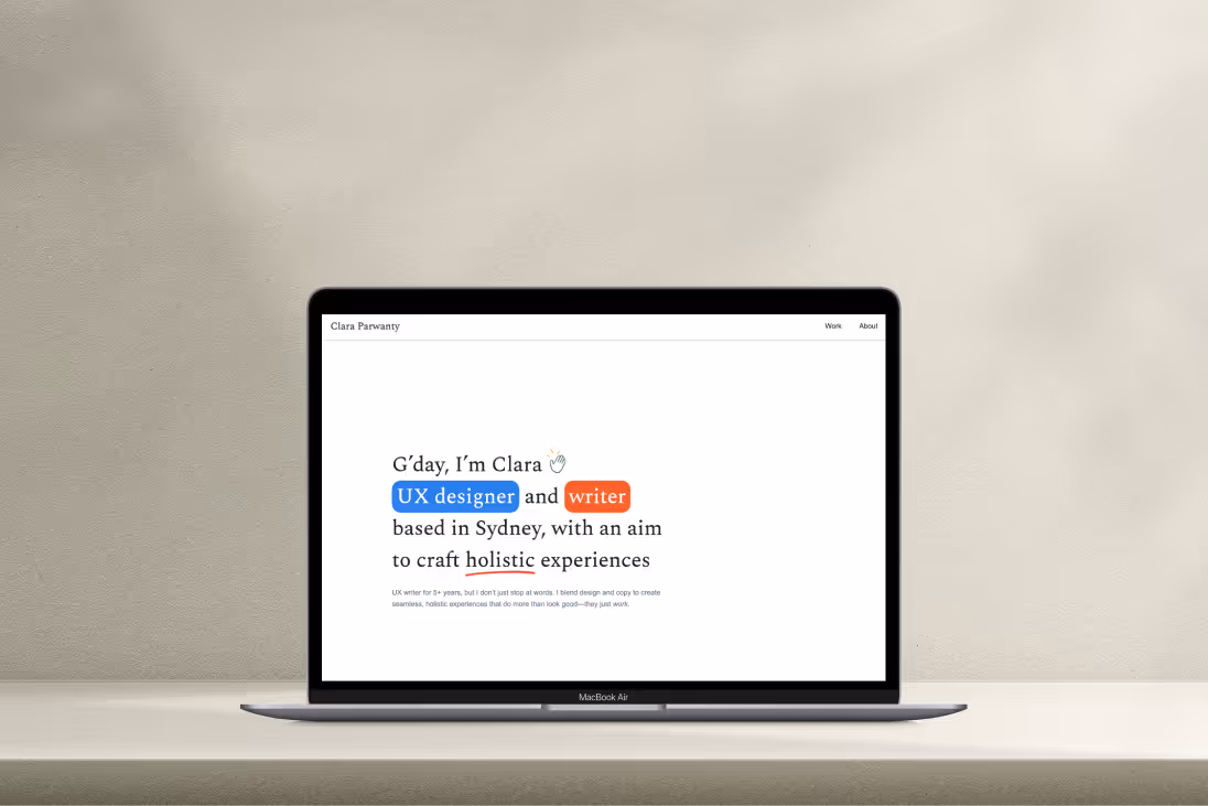
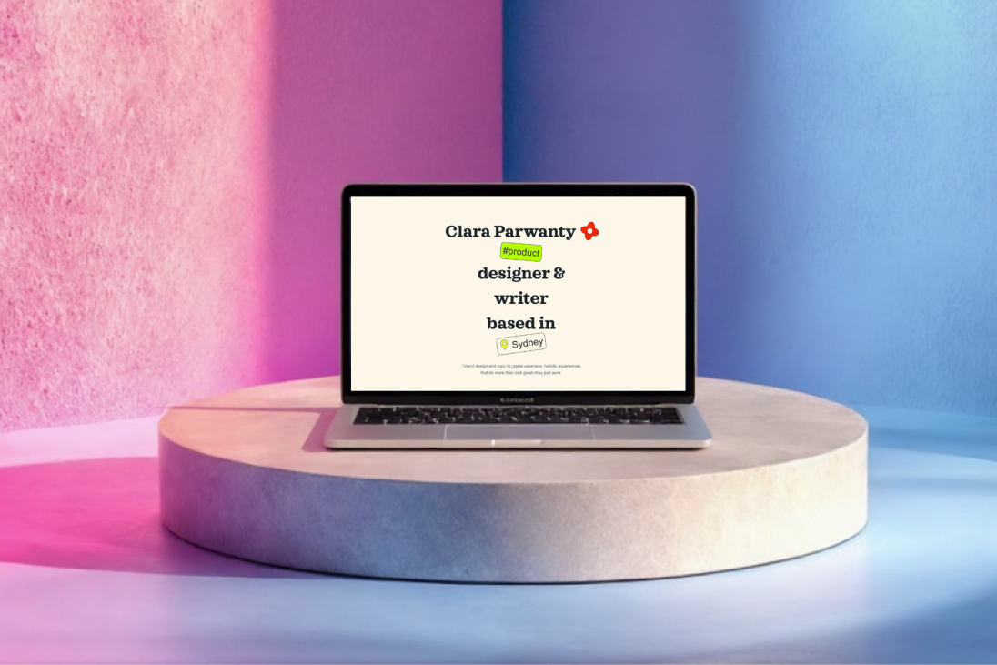
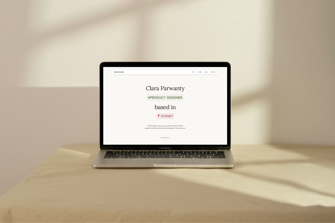
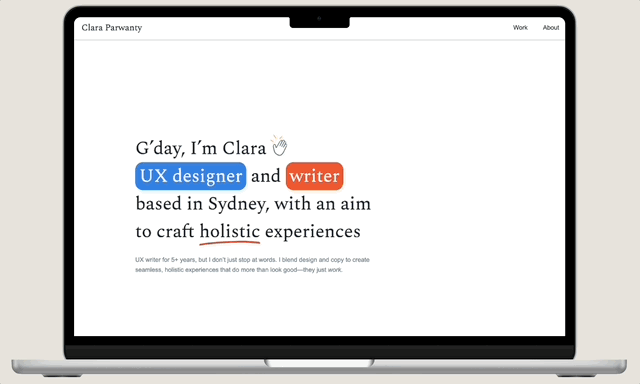
I’ve been drawn to that cosy, thoughtfully minimal vibe—the kind you find in cafés or tidy workspaces. So I went with warm neutrals (cream, soft white) and paired them with muted accents (sage green, dusty rose, soft lavender). Together, they feel approachable, calm, and just the right amount of fancy.

Why Outfit + Laura + JetBrains Mono?

I needed flexibility. Outfit (a sans-serif) is modern and geometric—perfect for UI and longer reads. Lora (a serif) brings a touch of warmth for headlines. Together, they strike a nice balance between clean structure and personality. JetBrains Mono gives that little nerdy sidekick for code and labels. Together, they tell story without shouting.

Why the floating navbar?

The floating pill-shaped navbar feels modern, sleek, and unobtrusive. It keeps navigation accessible without blocking content—adding a polished, design-forward touch that quietly stands out.

Why polaroid-style cards?

The thick white borders and slight rotations add a tactile, organic feel. It’s inspired by my love for photography: snapshots of moments, stacked and scattered, bringing warmth into the digital space.

What's the tools I use?

Every tool played its part in bringing this little digital home to life—and taught me something along the way.

🎨
Figma
My comfort zone. The place where all ideas start to take shape (and where I probably spend way too much time adjusting spacing by 2px).

It’s where the structure, flow, and visual rhythm came together before moving anywhere near code.
🖥️
Webflow
This was the real adventure. I taught myself how to use it—turning my basic front-end knowledge into responsive components and fluid typography with clamp().

Interactions were a whole new world (GSAP, I’m looking at you). But between endless debugging and small wins worth celebrating, I learned heaps.
👾
Claude AI
My behind-the-scenes creative partner. It helped me tidy up messy CSS, test ideas faster, and save hours that I could pour back into design. It’s like having a coding buddy who never gets tired.
📊
Google Analytics
The quiet teacher. After the redesign, checking the data became my little ritual. Seeing what worked—and what didn’t—helped me understand how people actually use this site, not just how it looks.
"
This portfolio is far from perfect—or even finished. It's a work in progress, just like me. It'll keep growing, evolving, and changing, and that's exactly how I want it.