UI design

Creating visual design for Bruno’s Best Friend

Bruno’s Best Friend is a dog walking app designed to connect dog owners with trusted walkers. This project was completed as part of the RMIT UI Design Course. I created a design system and redesigned the booking flow based on user research insights for a smoother user experience.
Role
UI Designer
Timeline
July – August 2024
Approach
Usability Testing
Platform
Mobile, Web
//
The challenge
The project brief revealed 3 major pain points: inconsistencies in the interface, unnoticeable buttons to view all walkers, and difficulties to rebook walkers.
//
Initial idea
I wanted to improved consistency and visibility
To address inconsistencies, I created reusable components. The See all walkers button is now a card at the end of the walker list, making it more noticeable as users browse before viewing the full list. For easier rebooking, a rebook section appears on the homepage and search results page when the user is logged in.
Early version
//
Usability testing
Observe how intuitively users interact with the initial design
The goal is to ensure users can book a dog walker seamlessly. Any delays in their interactions were crucial indicators of areas where the design could be improved.
//
Design decision
01
Resizing walker cards
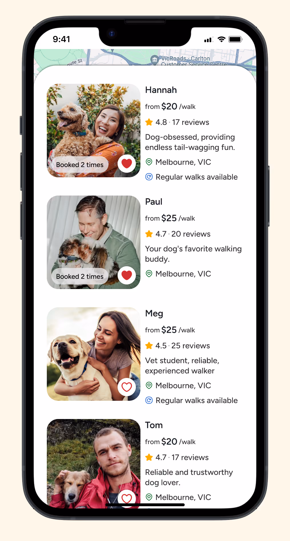
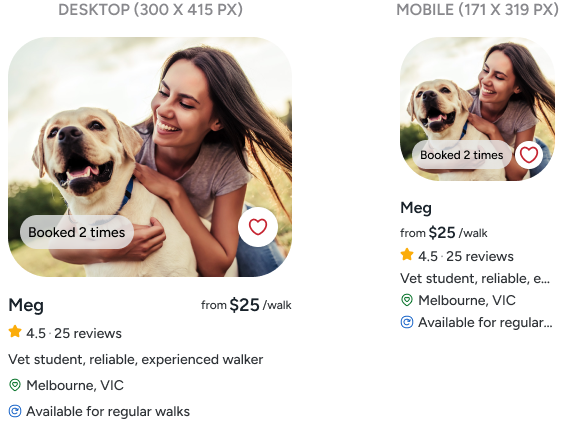
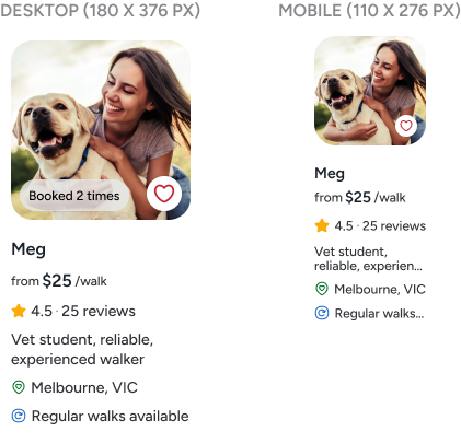
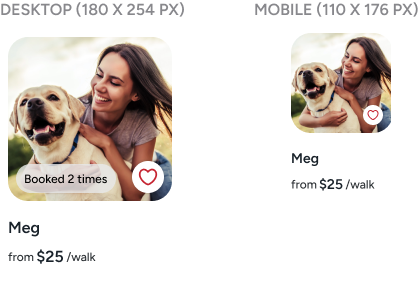
During testing, I noticed that the initial walker card size was overwhelming and took up too much space. To address this, I redesigned the cards to be more compact, allowing for a cleaner look and easier navigation.

As I continued testing, users pointed out that the previously booked walker cards were overloaded with unnecessary information. Since they had already gone through the hiring process and were familiar with their walkers, all the extra details felt redundant. This feedback helped refine the design, stripping down the cards to only the essentials, making the user experience more efficient.
Before
The initial card size was excessively large and took too much space.
After
Reducing the size of the walker card.
After
The previously booked walker card now displays only the most essential details, eliminating unnecessary information.
02
Moving the "See more walkers" button
I moved the See more walkers button from the end of the walker list to the front, making it more noticeable and harder to miss, ensuring users could quickly access the full list of walkers.
Before
Button to see more walkers at the end.
After
Button to see more walkers at the front.
03
Rebook walker section
Users were confused by the Rebook local walker and Other walkers in the area sections, so I streamlined the design by removing them entirely. Now, walkers are automatically sorted, prioritising those the user has already booked, simplifying the rebooking process.
Before
These sections were confusing.
After
Sections were removed, and walkers are now sorted to prioritise those the user has already booked.
04
Desktop navigation buttons
During testing, it became clear that swiping with a mouse wasn't intuitive for all users, so I switched to left and right navigation buttons for easier interaction.
Before
Horizontal scroll.
After
Horizontal scrolling was replaced with navigation buttons.
The final prototype – give it a go!
//
Design system
//
Takeaways
This project marked my first experience building a design system from scratch. Starting with a moodboard inspired by Toy Story, I crafted a playful colour palette while ensuring good contrast. The iconography drew inspiration from Andy’s handwriting on the toys. It was a fun project that really challenged my creativity, and I enjoyed every step. I learned that UI design isn’t just about creativity, but also about communication—how the interface speaks to users, guiding them without confusion so they can interact intuitively.
Luke Farrugia
Course Mentor
"
... It's exciting to see how user testing has shaped your decisions. The way you've incorporated feedback into the refined UI is impressive, clearly enhancing both usability and appeal. The aesthetic choices, from typography to colour palette, are on point, creating a harmonious interface that's both stylish and functional. Your design looks good and works beautifully, which is the ultimate goal.

Impressive work! This project is on a solid path and is something to be proud of for your portfolio. Well done!
← Go back
Updoc login and registration flow
Next →
Blibli content guidelines