


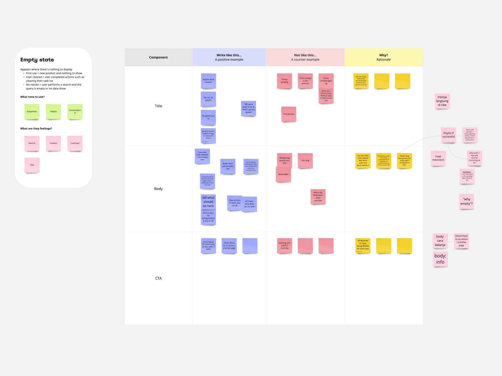
After mapping our tones, we went a step further – defining how each tone applies to specific types of content.
For example, when writing an empty state message, we found that the most suitable tones were empathetic, helpful, and conversational. At this stage, we also considered how users might feel – perhaps neutral, confused, or just curious – and tailored our tone accordingly.
Then, we broke down the message into parts: title, body, and CTA (call-to-action). To encourage deeper discussion, we used a table with prompts: Write like this, Not like this, and Why.

.gif)
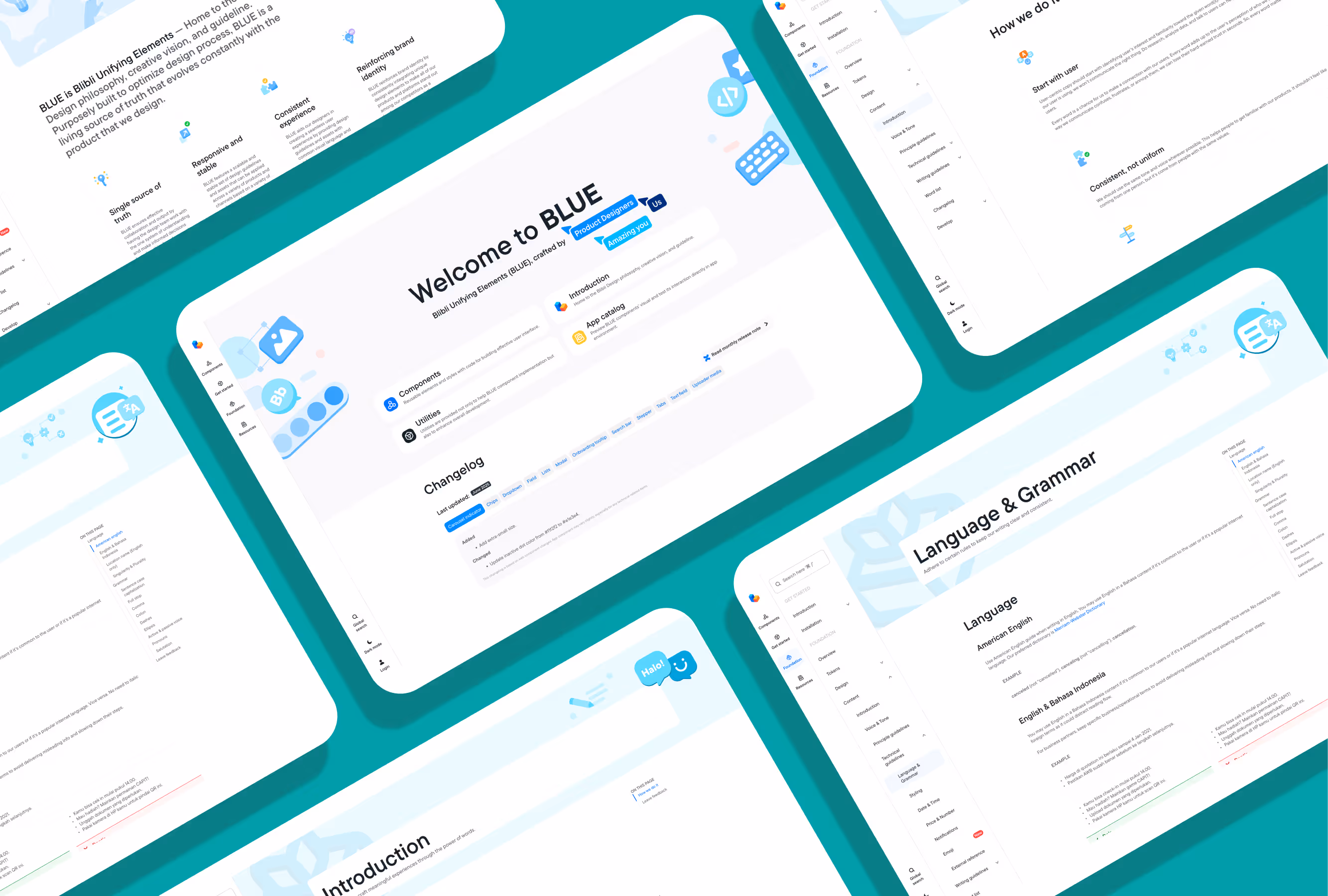
Collaboration didn't stop at documentation. Working closely with our designers, we aligned on font styles, spacing, and hierarchy to ensure that written content and visual design complemented each other.
These specifications were incorporated directly into the guideline, reinforcing the connection between tone, readability, and design as defined by the Blibli Design System.


To rebuild our word list, I collaborated with three writers to gather over 1,200 term entries from the entire writing team. This process involved having 13 writers submit terms used for their specific products – each entry complete with Bahasa and English versions, definitions, context, and example sentences – all by the agreed deadline.

The updated word list has become an essential reference tool – not only for writers but also for UX researchers and new team members.
✍️ Writers now use it for strategic consistency across content.
📊 UX researchers rely on it to design surveys and reports with aligned language.
🌱 New hires use it to quickly understand Blibli’s internal terminology and tone.